
The intended audience for our film was 11-18 year olds as it aimed to be a Movie targeted at Teenage girls. We tried to attract them by making the two main characters a similar age to themselves. Combining this with the upbeat pop music i feel we targeted our audience well. Our product may be distributed by an institution such as Disney Channel because of its plot that has a happy ending and is similar to other Films that are produced and distributed through Disney channel.
One in particular convention we could not forfil due to the equipment that we were using was the colour of the film. In the examples of chick flicks that we looked at the colour was very bright and looked like the brightness and saturation had been turned up. This quality of colour would only be possible to achieve if we were to use studio light and cameras, which is obviously too expensive and difficult for us to get hold of and use. Because of this the colours look duller and less vibrant than those of professional films.

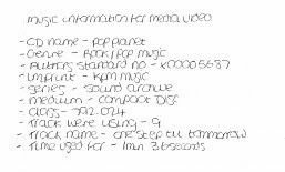
To create the film sequence we used film cameras with inbuilt microphone. This is a technology that has occurred through convergence of two separate technologies. We are using YouTube to publish our tittle sequences. This allows us to embed them into our blogs, the other main technology that we used. To edit the filming we used windows movie maker and Adobe Premiere Pro. I first edited the tittle sequence in windows movie maker before importing it into Premiere Pro to add the tittles. This was because tittles on windows movie maker look unprofessional and tacky as you cannot move them around the screen as it does it automatically.
In the final sequence there are a few problems that if we completed it again we would change. The first is the order that the tittles appear. They appear in a order against normal conventions. It should run Director, producer..... instead ours starts with "camera by.." this just looks odd. There is one particular bad shot that is bad, when
th
 e orange juice is being poured. In this shot it is
difficult to read the tittle that is written on the carton. This risks that the audience could not read the tittle. The overall look of the shot is bad as there is some pixelating and looks tacky.
Originally we planned to have only music in the opening sequence, after our first edit we changed this as it was becoming like a music video. By including diegetic sound it stopped this and now looks more like a tittle sequence as intended. The pouring of the orange juice and the shutting of the doors made drew the images together.
 We edited using Windows movie maker and Premier Pro. Both programs i had never used before the preliminary exercise. As a result of the absence of Andy, I edited the film. This was a real challenge for me as i had to learn how to use the technology. I think i successfully did this and am happy with the outcome. I used Windows movie maker to edit the film, using only diegetic sound on this film. I then imported this movie into Premier Pro and added the music and non diegetic tittles. I also learned how to save a movie file and upload it onto YouTube, something that i had not done before. This was followed by learning how to the embed this video onto my blog.
Overall i found the experience of creating this tittle sequence interesting and challenging. I was able to develop my camera skills and editing skills where both had been non exsisted before hand. The result of this was a finished product that i am happy with. If i had to do this again though, i dont think i would of used diegetic tittles. Despite them being a effective way of doing them it left us no control while editing and made them become less effective as a result.
No comments:
Post a Comment